

Graphic Design
Graphic design is where meaning takes shape, where symbols speak, color shifts perception, and composition becomes narrative.
This portfolio brings together a range of work that explores these ideas through academic and independent projects, including a visual series on semiotics and color, logo designs for fictional organizations and personal branding, a marketing package for the Bee Aware nonprofit, and a social awareness campaign centered on gender inequality and the wage gap. Across each piece, design is used not only to communicate, but to provoke, connect, and give form to ideas that might otherwise go unseen.
A motion graphics section is also included to showcase storytelling ability through full animation projects such as How Not to Call 911, graphics and motion animation featured in Paw Print Journey, where a puppy explores its environment, and a how-to video demonstrating proper video audition submissions for actors. These pieces highlight the role of motion design in creating engaging, informative, and narrative-driven visual experiences.
Graphic Series
Visual Vocabulary & Semiotics
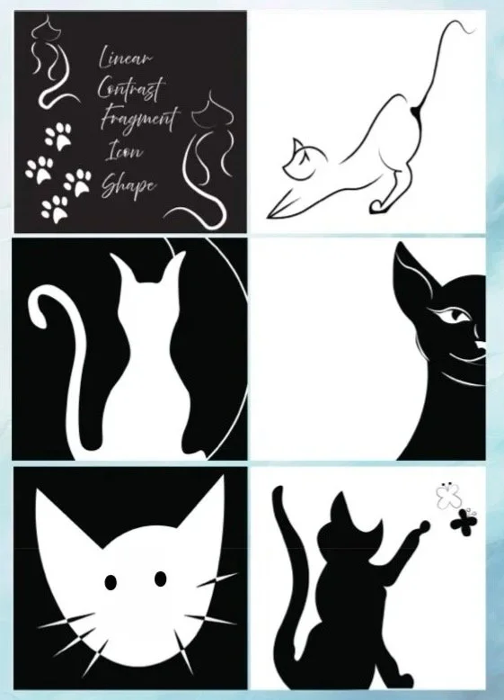
Created as part of my school studies, this series explores the language of graphic design through:
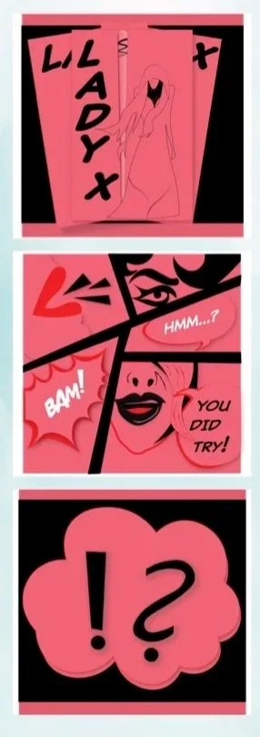
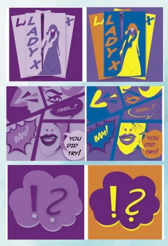
Linear, Contrast, Fragment, Icon, and Shape; building a visual vocabulary that speaks through form and structure. The second work expands into Semiotics and Color, using imagery from a fictinal graphic novel to examine how meaning is constructed and how color can transform perception. I developed 3 sets of 3 compositions, each pairing the cover of the novel, a sample page, and a symbol from the story. Every set is unified by a distinct color scheme to evoke a different emotional response from the viewer. Red and Black for intensity and drama, Purple Tones for mystery and depth, and a vibrant contrast of Blue, Yellow, and Orange for energy and tension. Together, the series reveals how symbols, palette, and composition work in harmony to communicate mood, narrative, and meaning.
Logo Design
A collection of logos designed for fictional organizations, my thesis film, and my personal brand.
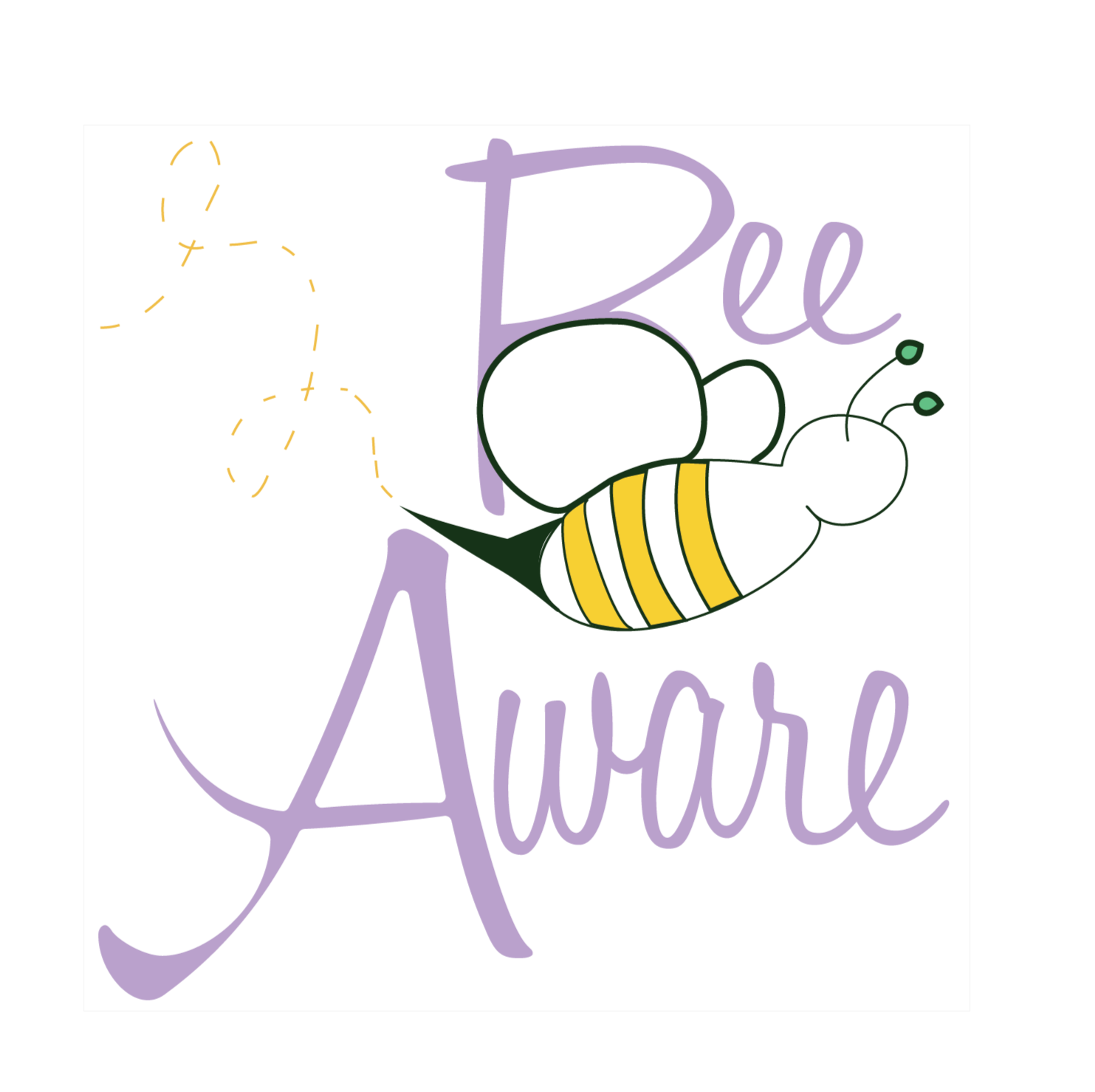
Bee Aware uses flowing type, pastel color, and a bee integrated into the lettering to promote conservation awareness.
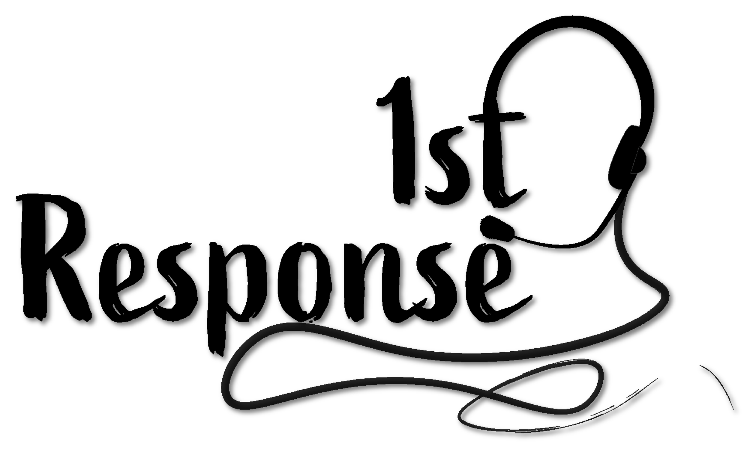
1st Response features a minimal black wordmark with a dispatcher headset built into the “t,” reflecting the focus of my thesis film.
JP Media is a clean, minimal logo with bold initials and a film strip detail, created for my website branding.
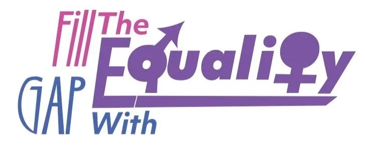
Fill the Gap with Equality uses the male and female symbols within the wordmark and a pink, purple, and blue palette to represent equal pay awareness.
Marketing Package
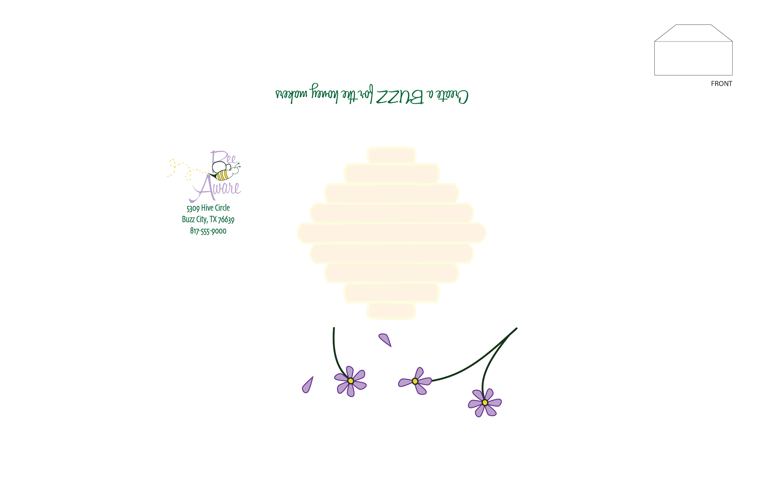
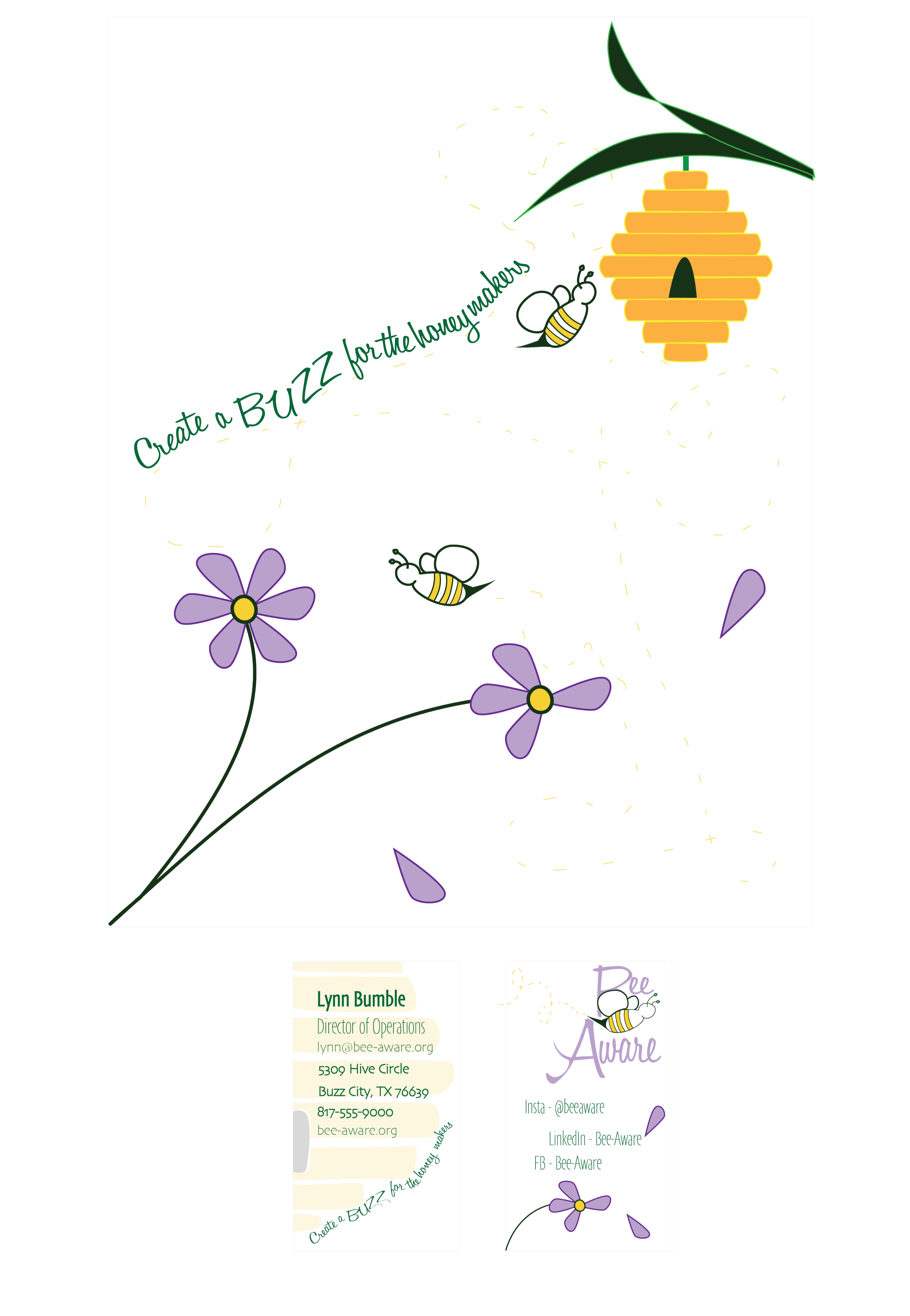
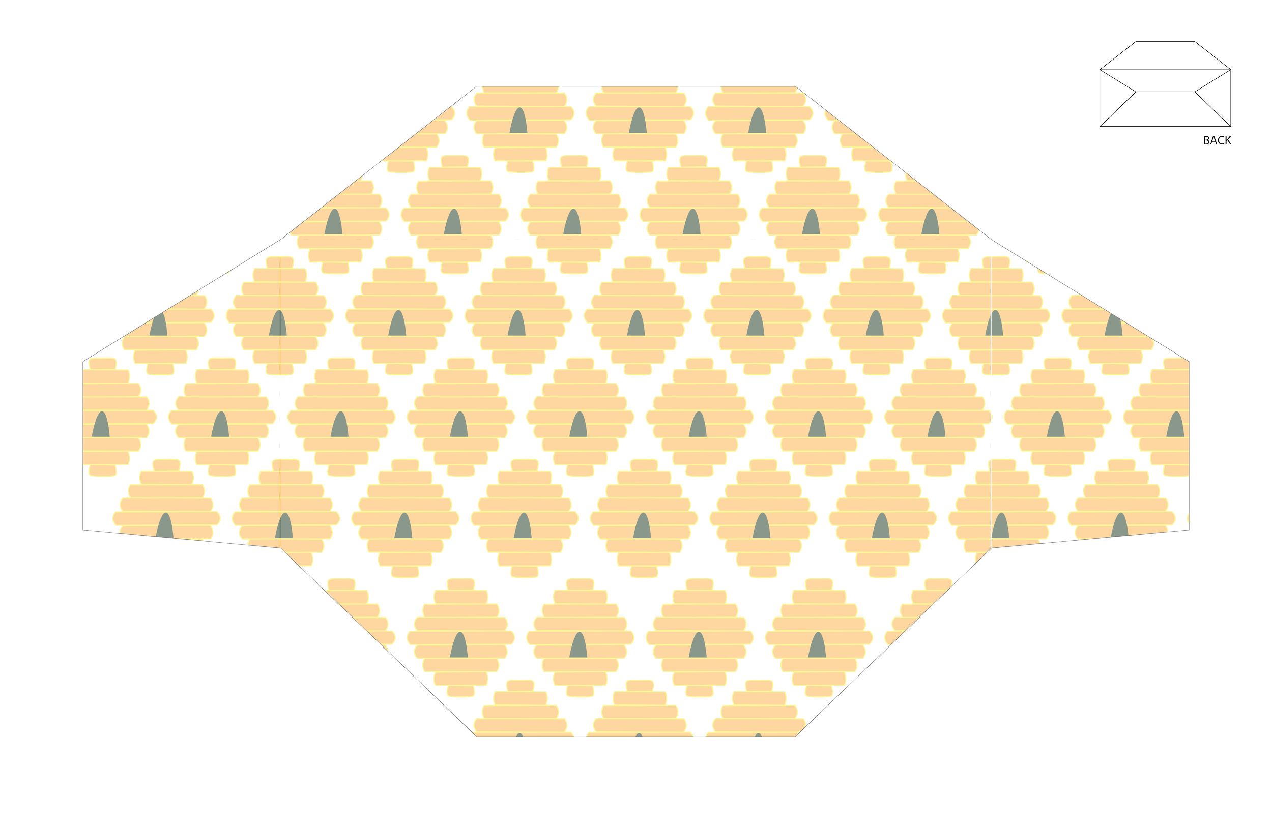
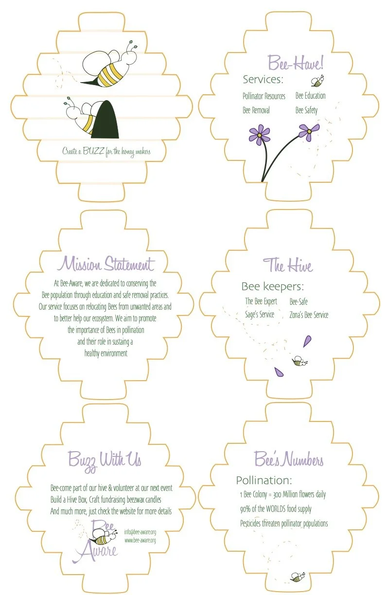
Created for the fictional Bee Aware nonprofit, this branding package blooms with purpose through a letterhead, business card, and hive-shaped pamphlet.
The bee icon carries through each piece, while spring flowers weave in an atmospheric, nature-inspired touch. The pamphlet unfolds with a mission statement, services, fellow beekeepers, a call to action, and contact information, all housed within a bee hive form that echoes the world it seeks to protect.






Social Awareness Campaign
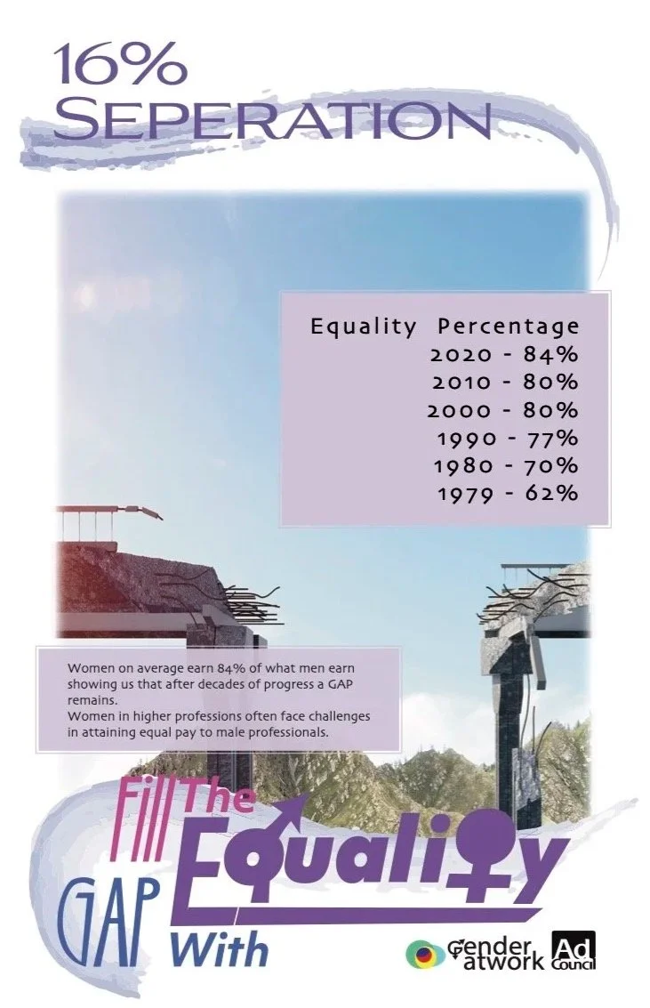
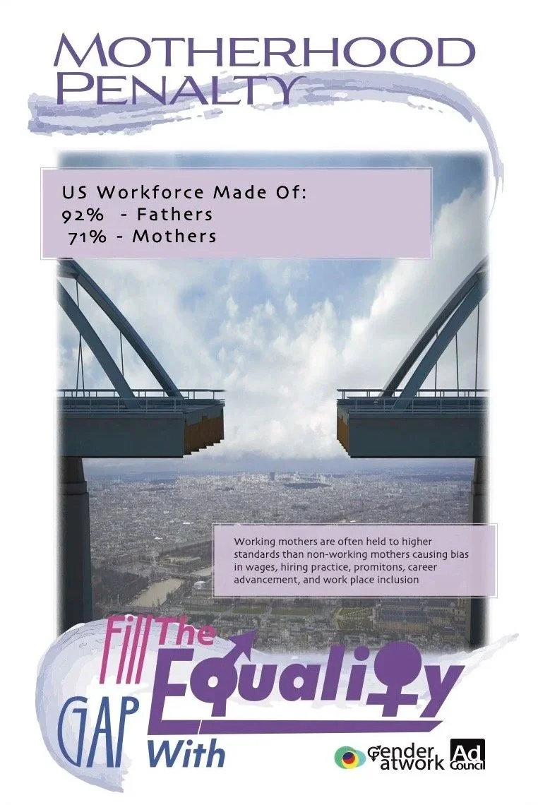
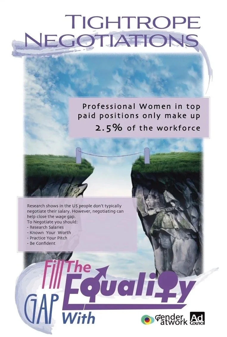
A three-poster social awareness campaign addressing gender inequality and the wage gap.
16% Separation presents statistical data on workplace inequality, Motherhood Penalty explores the disproportionate challenges women face as mothers in professional environments, and Tight Rope Negotiations offers guidance for negotiating raises and promotions. Each poster incorporates imagery of bridges or separation to emphasize the divide the campaign aims to close.
Motion Graphics
This is where storytelling comes to life through movement, rhythm, and visual expression. This collection highlights animation projects that blend creativity and communication, from the full animated short How Not to Call 911 to the live-action and motion animation in Paw Print Journey, and a How-To video guide for actors. Together, these pieces showcase how motion design can create engaging, informative, and narrative-driven visual experiences.